AI/ML
AI Assistants
The Context Stack That Fixes AI Design Slop

Written By
Kyle Milne
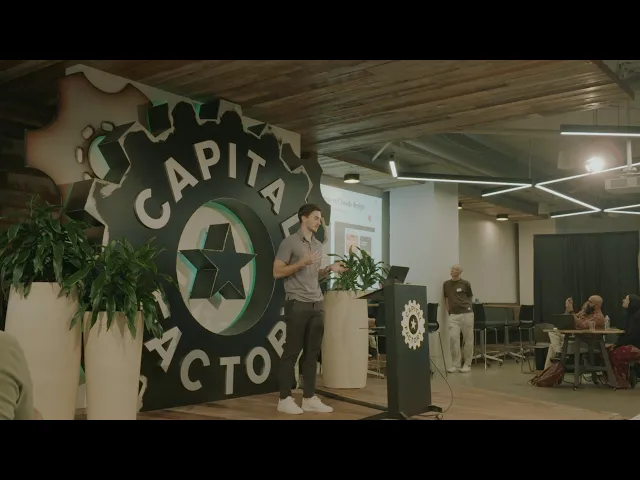
Based on The Context Stack That Fixes AI Design Slop, a talk Kyle Milne, founder of Monico, gave at the Claude Community Austin meetup on September 14, 2026.

Overview
AI design slop happens when the model lacks product context. It fills the gaps with familiar patterns, and you get screens that feel generic, sloppy, and just wrong for your product.
A short prompt will get you something that looks like a UI. It won't get you something you can hand off. The model invents a color palette, overloads the screen with copy, and misses the look and feel you already have in production. A little more context helps, but the result may still not match the product your users already know.
That matters if you already have an app on the store, a user base, and a design language. New screens have to feel like they belong there, especially in account creation, onboarding, or a payment flow. If the work looks like a different product, you can't ship it as-is.
This post walks through the context stack I use at Monico to brief AI on real product work. I'll use a client project from the talk: an education app that already had a live product, where our job was to redesign account creation and onboarding and launch a 7-day free trial for a new B2C revenue channel, in the same look and feel as the product today.
TL;DR
Design quality is capped by context quality. Give the model a PRD, visual references, and a design.md file that captures your design system, then refine the output in Claude or Figma. The same stack works with any model or platform.
AI design slop shows up when you ask for a screen without giving the model your product, your users, or your design system.
A PRD should cover the initiative, the value, the user and their mindset, the features and flows, the constraints, and what success looks like.
Visual references from real apps tell the model the pattern, layout, and style you want, not a generic idea of a "nice" screen.
A
design.mdfile writes down the rules the product already follows: type, color, components, and icon or illustration packs.After the model drafts a screen, use select or annotate tools, or make direct edits in Figma and sync the changes back.
You can apply this context stack to any model or platform, not only Claude.
Why do AI-generated screens look so out of place?
They look out of place because the model is guessing. Without product context, it reaches for familiar patterns and invents the rest, so the screen doesn't match the product you already have.
To show this, I went into the Claude desktop app and gave it almost no context. I asked it to create a free trial for an education app, explain how the 7-day trial works, and let the user pay monthly or annually. What came back was dark and moody, which is a poor fit for an education product. It invented its own color palette. The screen was overloaded with copy, and it obviously looked like AI made it.

I asked the same thing in the Claude design web app. As a previous speaker at the meetup pointed out, that app asks a few questions first, like who the app is for, the visual direction, and a primary color. A little context goes a long way. The result was better. It still wasn't something I could hand off. It looked, as I said in the talk, very Halloween Town.
That's the thesis: design quality is capped by context quality. If you want better screens, you have to give the model more to work with than a one-line prompt.

What is the context stack that fixes AI design slop?
The context stack is the set of inputs I give a model before I ask it to design a screen: a PRD, visual references, and a design.md file. I think about it like baking a cake.
The first layer is the ingredients, your product requirements doc. That explains what you're building, for whom, and why.
The second layer is the form, the visual references. Those give the model direction on what good design looks like for this screen.
The third layer is the styling, the
design.mdfile. That's the written design rules for how the product is allowed to look.

What belongs in a PRD for AI design tools?
A PRD for this kind of work is the who, what, where, when, and how. If those aren't written down, the model will fill them in for you.
Start with the initiative and a short overview. Why are you doing this, and what's the value? Who is the user base, and what's their mindset going into this feature or this flow? Outline the key features and the user flows inside them. Then get the constraints on the page: technical blockers, assumptions, and what success looks like when someone interacts with the feature.
On the education app project, the value was a new B2C revenue channel, converting people who were curious about the product into subscribers. The users were students, from middle school through university. They were curious but unconvinced, and they were trying to decide whether the product was worth paying for. We also identified the key features, the user flow, and a set of constraints the team wanted to keep top of mind.
If the model doesn't know those constraints, it will design past them.

How do visual references help an AI design a better screen?
Visual references show the model the pattern, layout, and style you want, using real screens instead of a vague style prompt. I like using Mobbin, Refero, or Godly, which are libraries of design patterns from real apps on the App Store.
For the subscription page, I curated a set of references I thought would work and picked the one in the middle, because it was simple and straightforward. That told the model what I wanted this screen to feel like, without asking it to invent the layout.

What is a design.md file, and why does AI need one?
A design.md file is a written version of your design system, written so the model can follow it. It should cover the type scale, the color palette, the component library your repo is using, and any icon or illustration pack.
On this project, the client already had a live product and an established design language. I went into the repo and asked Claude to create a design.md based on the design system we were already using. The file isn't a new brand. It's a set of rules that keep new screens inside the system you already have.
If you skip this layer, the model will invent typography, color, and components, even when your product already has them.
I also made a design.md template and a PRD template as a free resource. They're in the Context Is King Presentation Assets from the talk, along with the presentation notes and illustrations.

What happens when you give the model the full context stack?
The output gets closer to something you can use, though you'll still need to refine it.
I went back to the Claude desktop app with the PRD, the design.md file, and the visual reference, and asked it to create the payment screen. The only extra direction I added was a layout note: instead of putting the illustration at the top, put it at the bottom, coming up from the button. What came back was cleaner and simpler, and much closer to our vision.
I still wanted changes. I'm a designer, and I'm a perfectionist. I wanted the illustration to be bigger, some refinements to the copy, and the border stroke around the middle piece of content removed. The stack gets the screen into the right system. You still have to finish the details.

Payment screen generated with a PRD, a visual reference, and a design.md file, much closer to the existing product.
How do you refine AI-generated screens once you have a strong draft?
You refine them in place, either by pointing at specific elements in the preview or by editing the screen in Figma and syncing the changes back. You don't need to throw out the draft and start over.
In the Claude desktop app, I had the design in a localhost preview. The select element and annotate tools let you click a specific area and say what to change. I clicked the middle section and asked it to get rid of the border.
The other way, and the one I prefer, is to have Claude create the screen in Figma. Then I can make quick visual tweaks, refine the copy, check the spacing, and ask Claude to sync those changes back.
The before, middle, and after make the difference easy to see. Little context gives you slop. The full stack, plus a few targeted refinements, gets you to something that fits the product.

We used the same process for the rest of the flow, just with different visuals or sketches for each screen, so account creation, onboarding, and the trial stayed in the same look and feel.

Can you use this context stack with models other than Claude?
Yes. You can apply this context stack to any model or platform. The files are what matter: product intent, visual direction, and design system rules, plus a way to make small refinements in the tool you already use.
If you want to try this on a screen this week, start with the Context Is King Presentation Assets from the talk.
How Monico approaches this
This is how we brief AI when we take on product work. The larger job is designing high-priority flows so they ship at full scope, in the look and feel of the product you already have. That's Design & Handoff, our 6 to 8 week engagement for a flow that's losing users, or a new feature your own team will build. We research the problem, design the flows or the new feature, test with real users, and hand your engineers everything they need to build it.
The work is done by a small team of handpicked senior specialists, at a fixed price that starts at $58K and is agreed before kickoff. If you also need the work built in your repo, Design & Ship starts at $100K and runs 8 to 10 weeks. If you have a live product, an established design language, and a flow or feature that has to match what's already there, we'd love to hear what you're working on. Book a call and we'll talk through whether it's a fit.
Final thoughts
The model will always give you a screen. Whether that screen belongs in your product depends less on which tool you used, and more on whether you gave it the problem, the user, the references, and the rules it was missing.
If you're using Claude or another AI design tool on a real initiative, pick one screen in an existing flow and brief it with a PRD, a visual reference, and a design.md file. Compare that result with whatever you get from a one-line prompt. The gap between those two outputs is the context you were leaving out.
By Kyle Milne, founder of Monico · About an 8 minute read
Sources
Kyle Milne, "The Context Stack That Fixes AI Design Slop | Claude Austin," recorded September 14, 2026, at the Claude Community Austin meetup, Capital Factory: https://youtu.be/bSOeDwtLOac
Presentation assets, including the PRD and
design.mdtemplates: Context Is King Presentation Assets
Written By
Kyle Milne
Updated on
