b.well - Member App
Redesigning b.well's white-label member app to give health plan members the clarity to self-serve.
COMPANY STAGE
Series C
SERVICE PROVIDED
Design & Handoff
TIMELINE
8 Weeks
A member app creating more work than it solved
b.well Connected Health had an MVP member app already live with a handful of health plan clients. The app gave members a way to view their coverage, check claims, and find care online. The problem: the app was built for health plans, not for members… and members could tell.
The app was dense with insurance terminology, difficult to navigate, and built around information structures that made sense to payers but not to patients. Instead of self-serving, members called. Support tickets climbed. And when b.well brought on a new client (with over 700K members) to replace a previous member app that had already failed them, they needed Monico to fix what wasn't working and build something every health plan client could launch with confidence.
Fixing the front door
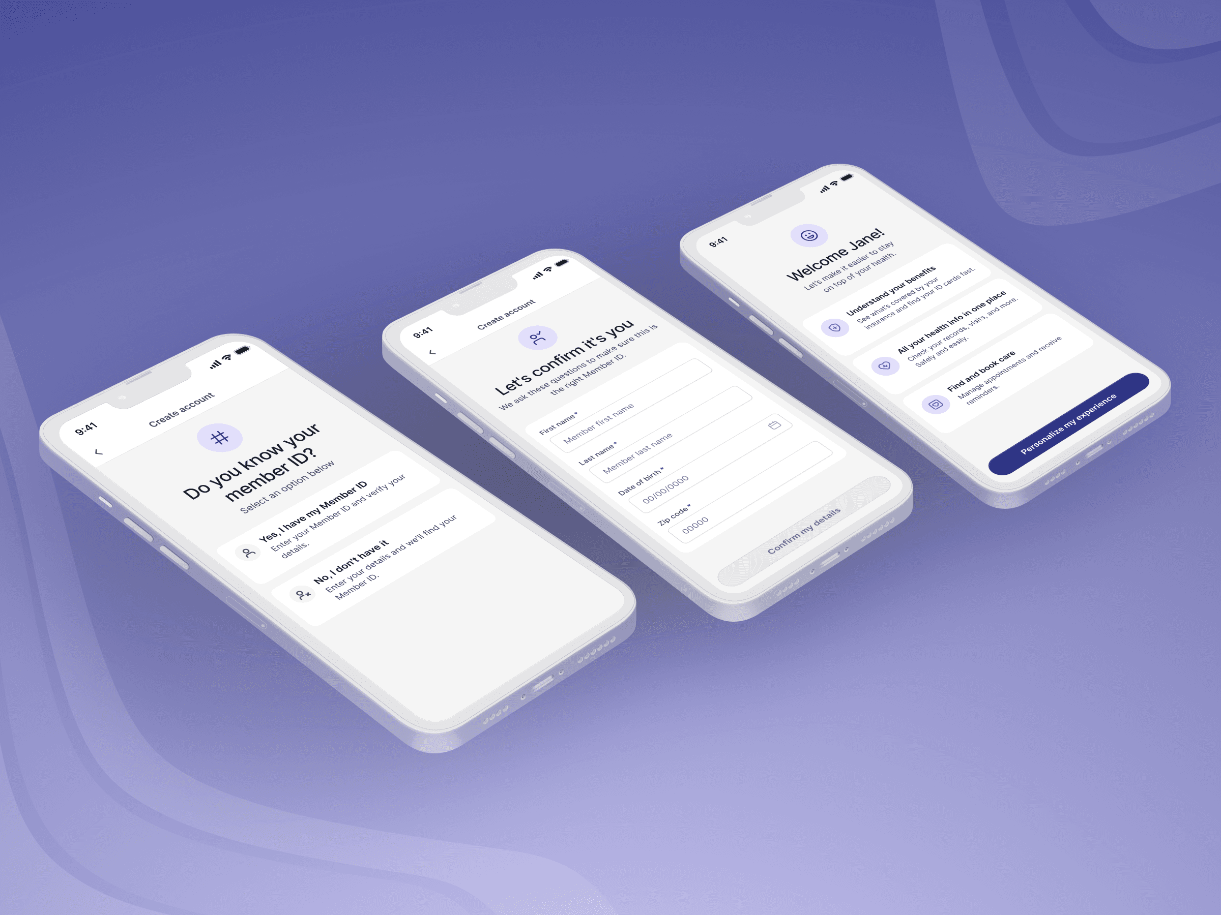
A problem shared across health plan clients was that a meaningful portion of members never made it past account creation. Drop-off during onboarding was high enough that large segments of the user base had never seen the home screen.
Monico rebuilt account creation and onboarding from the ground up, removing the confusion and friction that caused members to abandon the app before experiencing any value. Account creation was streamlined into two paths: enter a member ID and confirm a few details to verify and link the account, or (if the ID wasn’t handy), use a guided lookup that kept members moving instead of dropping off. Onboarding was then personalized to each member’s stated goals, surfacing the features most relevant to why they opened the app rather than presenting everything at once.
An insurance overview members can understand
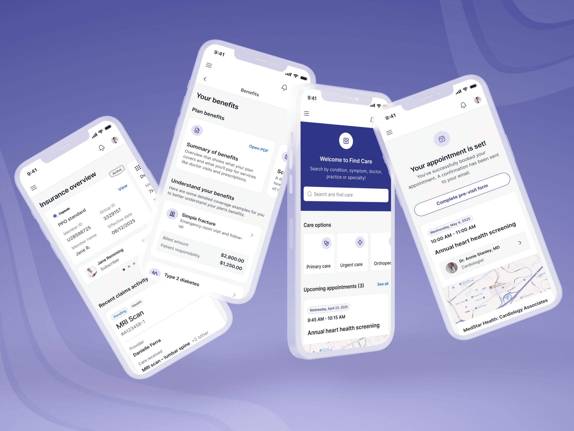
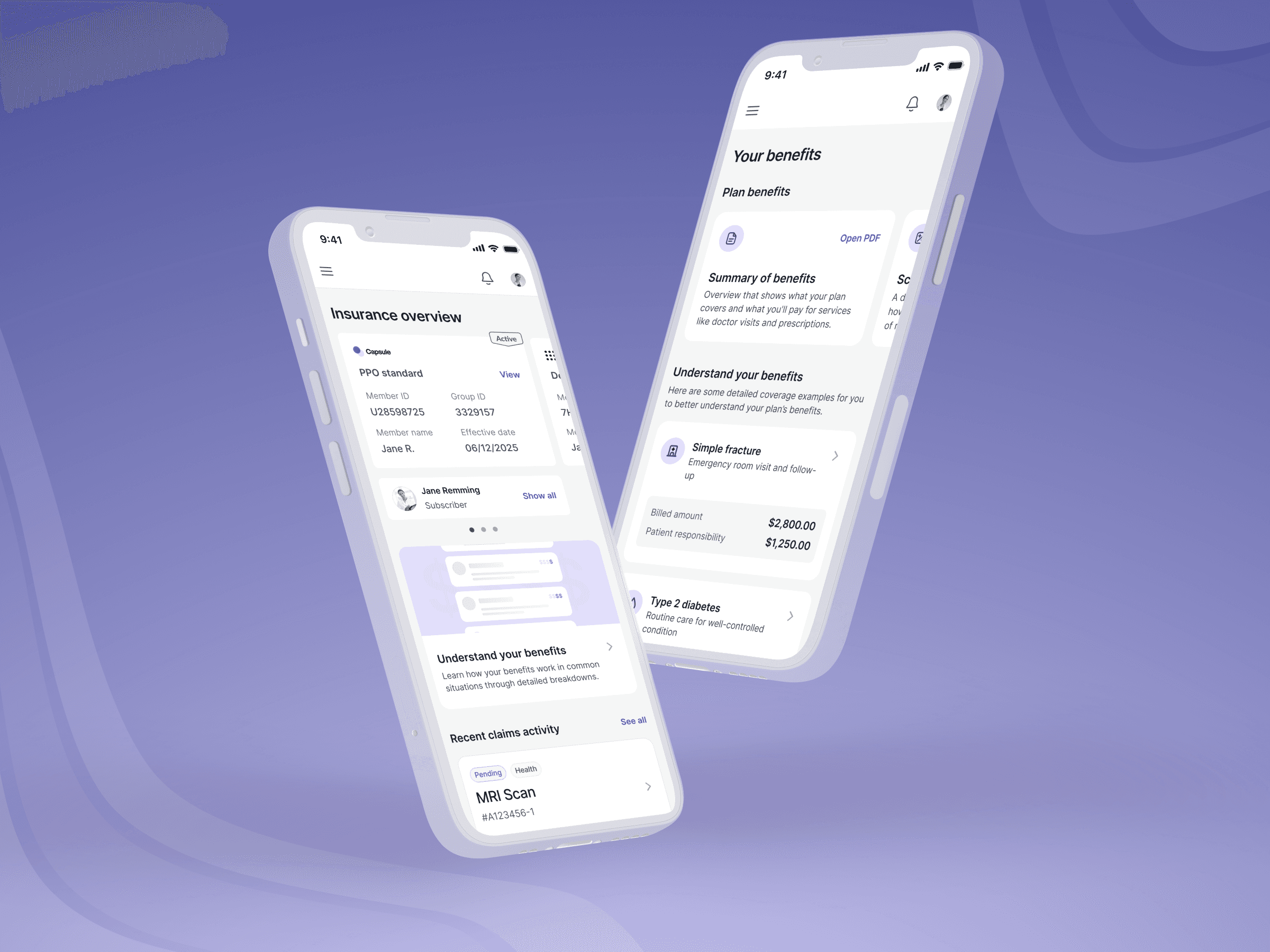
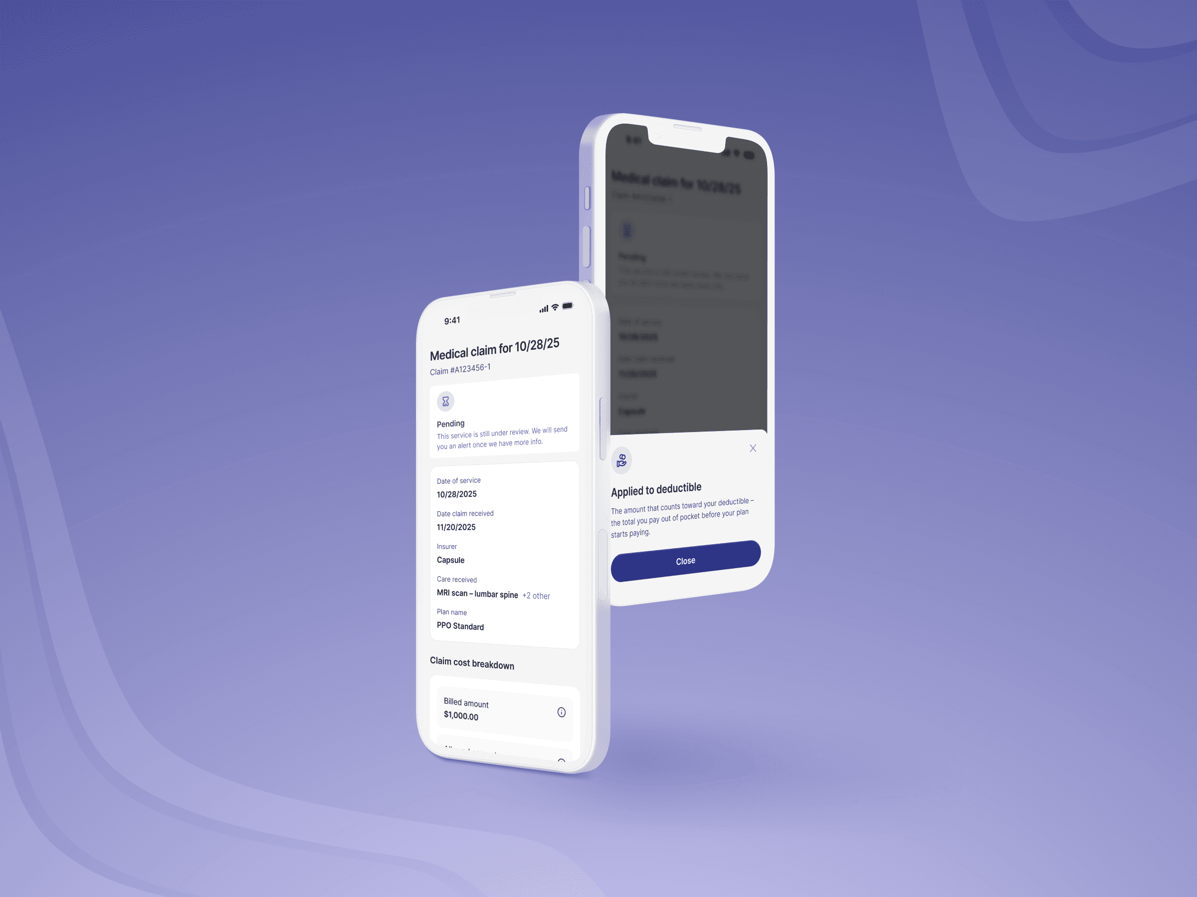
Once members made it in, the experience still lost them. Benefits information was packed & scattered into the overview page (alongside other sections like recent claim activity and deductible info). Technical insurance terminology was presented throughout with no added context. The claim card structure was hard to understand at a glance. Additionally, a key need for this new health plan client was for users to easily access their digital ID.
Monico redesigned the core experience by restructuring the overview page to make it easier to digest, giving members at-a-glance views with the option to dig deeper. We also surfaced what members reach for most based on user insights. We humanized technical jargon wherever possible and added contextual help text for the terms that had to stay. The claims view was also rebuilt to show claim status in a simple, easy-to-scan format rather than a wall of fields. The information was always there; now members can find it.
A find-and-book experience built around how people choose a doctor
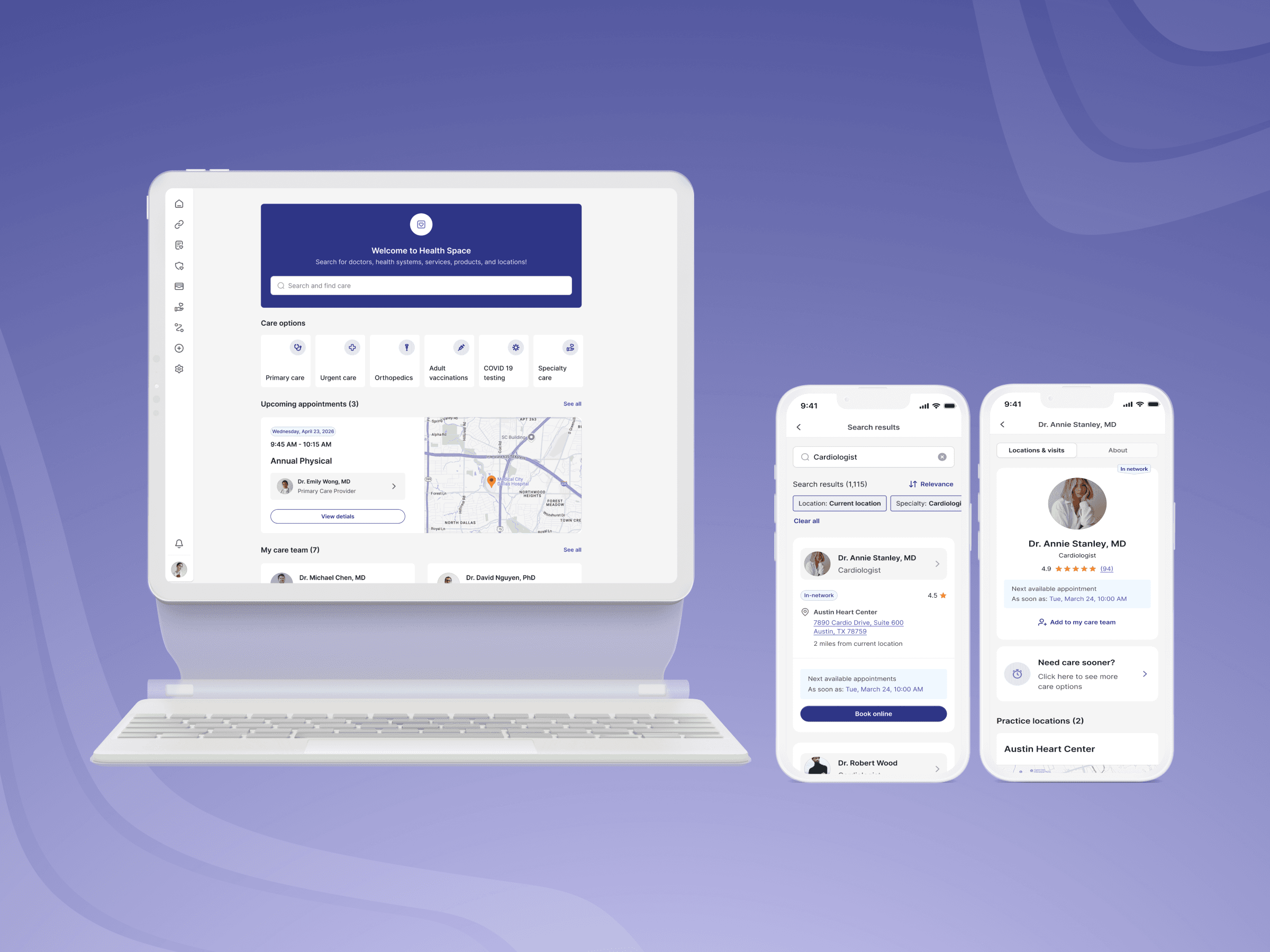
Booking an appointment was among the most common reasons members opened the app and among the most common reasons they gave up and called support instead. The search experience was limited, doctor profiles lacked the information members needed to make a confident decision, and the booking flow itself introduced unnecessary friction at every step.
Monico rebuilt the find-and-book experience with the same logic that made Zocdoc the standard for online appointment booking. Search was redesigned to lead with popular specialties tailored to each member's health profile, with the ability to search by doctor name, facility, or condition and symptom. Doctor profiles were expanded to show the details that drive booking decisions: ratings, accepted insurance plans, practice locations, and next available appointment, all presented clearly without overwhelming the screen. The booking flow was then streamlined to move members from search to confirmed appointment without unnecessary steps.
Closing the loop after booking
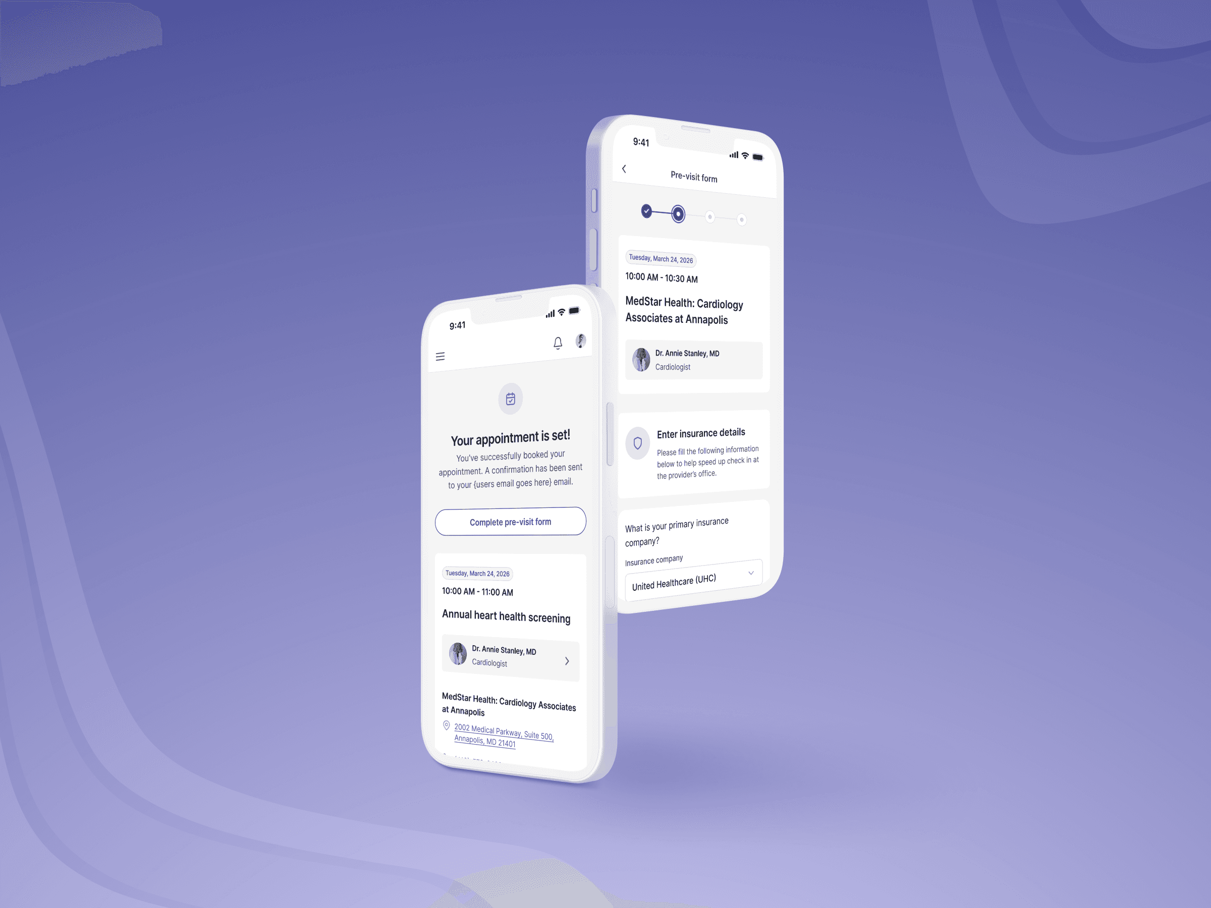
One underused moment in the existing experience was the confirmation screen after a booking was made. Health plans and providers both benefit when patients complete pre-visit intake forms in advance, but most apps surface this as a separate task sent via email that members never get around to or completely forget.
Monico built the pre-visit form directly into the appointment confirmation screen, capturing it at the highest-attention moment in the entire booking flow. From there, booked appointments appear on the member home screen with clear management options (reschedule, cancel, or add to calendar) so members leave knowing exactly what to do next.
Outcomes
64% drop in support tickets and CS calls: Members could find their coverage, understand their claims, and book care without picking up the phone
172% increase in online appointment bookings: The rebuilt search and booking experience converted members who previously gave up and called
115% increase in pre-visit forms completed before appointments: Integrating the intake form into the confirmation screen created a high-completion moment that improved care quality across client health plans
Monthly app activity steadily climbing: With a clearer, faster experience, members are returning to the app instead of avoiding it
Deployed across four health plan clients including WellSense (700,000+ members), ThedaCare, and MedStar.